How Virgin Atlantic has developed its brand in the sky
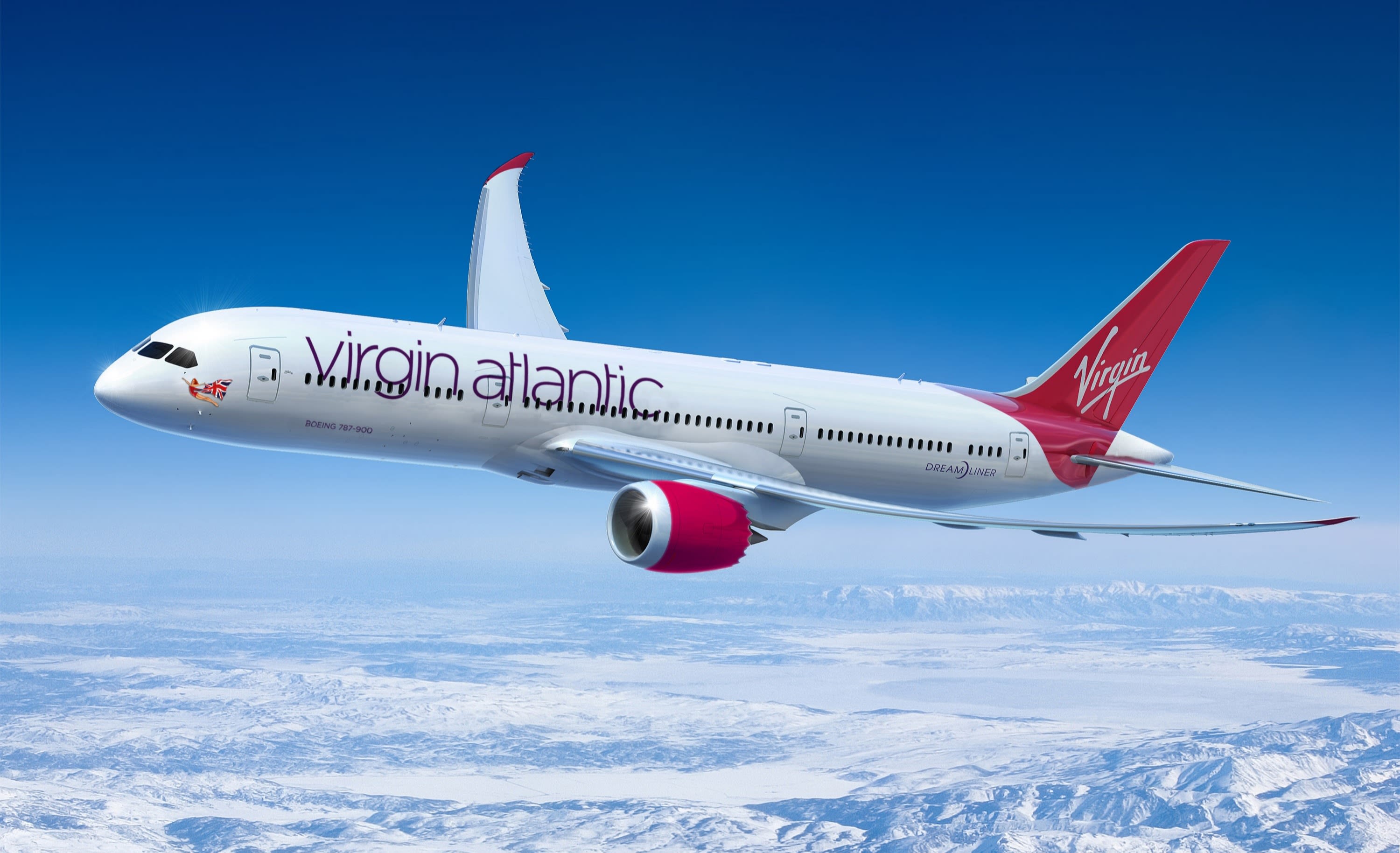
Virgin Atlantic has arguably one of the most recognisable brands in the air. Sporting striking red details and, of course, the famous flying lady, Virgin Atlantic’s planes are unique in many ways. But how has the design evolved over the years? We caught up with Nina Jenkins, who leads the brand design team at the airline, to find out…
Jenkins says that the livery design is one of the main ways of identifying the brand – and that’s why it’s so important to Virgin Atlantic to get it right. “It has developed in many ways since the launch of the airline in 1984 and remains one of the most iconic and memorable visual expressions of the brand. It needs to look strong on a single aircraft as well as lined up in a row at the airport. It’s therefore really important that it’s designed to look distinctive and uniquely right for us, clearly differentiating us from our competitors and building brand recognition.
“Our livery design has evolved and developed over the years and is made up of several visual signatures which, together, make our aircraft look unique. Many airlines have a red tail fin,” she says says. “Some even have red cowlings (the jet engines). Other Virgin airlines use similar graphic elements. So the Virgin Atlantic livery has to make all these signatures work as one to look authentic – it’s much more than the sum of the parts.”
But, it’s not just about looking great – the livery also has to work incredibly hard, withstanding air friction at 500 miles per hour, Jenkins explains. It also has to be able to deal with a huge range of temperatures – from the intense heat on the ground in Dubai or Las Vegas to temperatures that can reach as low as -40 degrees Celsius when cruising at altitude.
Over the years, Virgin Atlantic’s planes have taken on a number of different looks, from Maiden Voyager, which didn’t actually feature a Virgin Atlantic logo, to planes in the 1990s that not only featured a large Virgin Atlantic logo in lowercase across the fuselage but also carried ‘NO WAY BA/AA’ in protest against the merger of British Airways and American Airlines.
“Our current livery was introduced in the rebrand of 2010 and was created by design consultancy Johnson Banks in collaboration with our Brand Design team,” Jenkins explains. “This scheme was designed to optimise and enhance the livery’s now iconic visual signatures and refine them for the future. It’s lighter, more sophisticated and polished and reflects our award winning design and more premium offering.”
Over the years, there have been numerous special editions of the livery to celebrate or commemorate different things. In 2010, Virgin Atlantic teamed up with Universal Orlando and Virgin Holidays to promote The Wizarding World of Harry Potter with a huge Harry Potter decal applied to the plane. In 2013, to mark the 25th anniversary of Where’s Wally, the airline hid Wally in the livery on Barbarella, one of their Boeing 747 planes, for a year.
In 2005, for the airline’s 21st birthday, the flying lady, who is usually featured on the front of Virgin Atlantic’s planes got a starring role. Instead of appearing small at the front of the plane, the airline created a giant special edition of the flying lady livery with her trailing her flag into the red Virgin tail fin.
Nine years later, she received another update for Virgin Atlantic’s first Boeing 787 Dreamliner aircraft. “Hovering upright, she raises a super-sized champagne coupe and celebrates being Birthday Girl,” Jenkins explains, referencing the name of the new plane. “This was a particularly challenging special edition because, for the first time ever, we see her face straight on. This version was a collaboration between our Brand Design team and illustrator John Dyer.”
Who knows what could be next for the livery design at Virgin Atlantic, but with the airline having ordered new Airbus 350-1000 planes that will be arriving from 2019 they’re sure to have something impressive planned…


